The gist
Axie UI is a small React component library I made for fun.
I wanted to build a React system that felt tactile without getting loud: buttons with weight, fields with clear states, overlays that feel useful, and docs that make the components easy to try.
Why I made it
Most of my projects are full products. Axie was different. It was a place to practice the details that make product interfaces feel better: spacing, density, motion, disabled states, keyboard hints, empty states, and how component APIs should feel when someone actually builds with them.
It became a design systems playground for the kind of UI I like: compact, controlled, a little opinionated, and built for real app surfaces instead of marketing sections.
What it includes
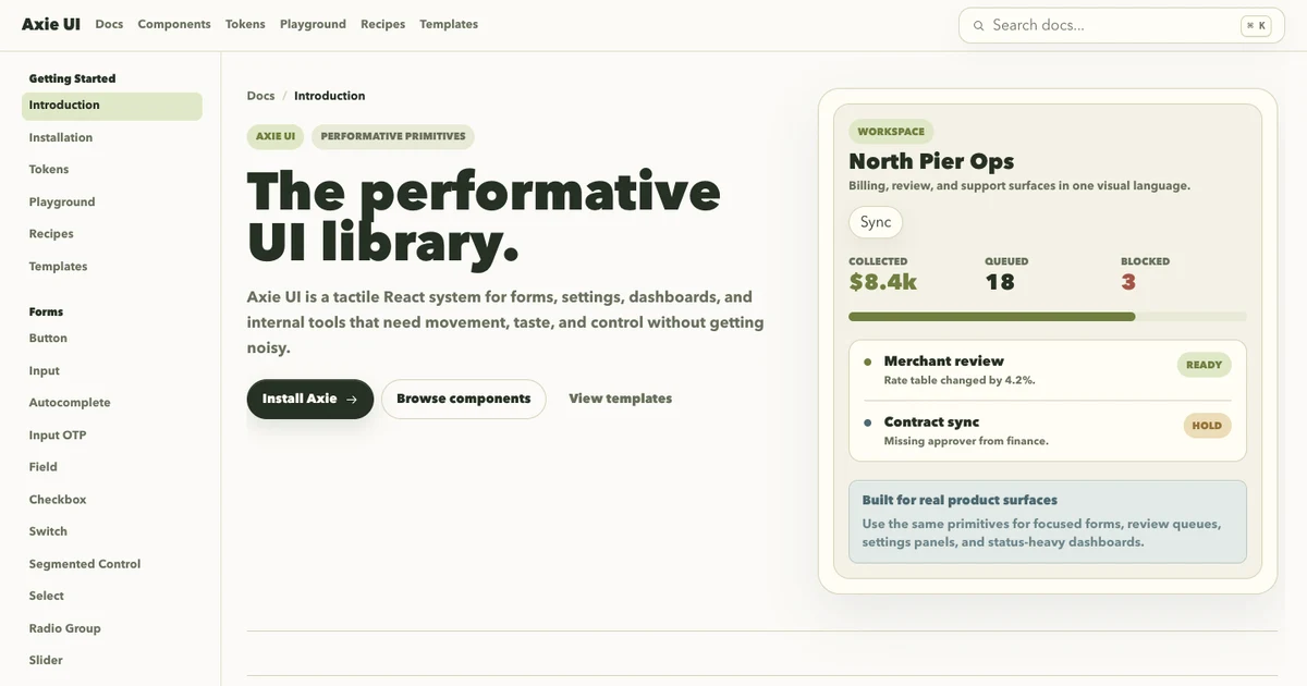
The library has docs for forms, overlays, feedback, navigation, and data display primitives. It also includes tokens, a playground, recipes, and full-page templates so the primitives are shown under real layout pressure.

What I learned
Building Axie made me think less like a page designer and more like a systems designer.
Every primitive needed more than a default state. Inputs needed focus, invalid, disabled, and helper states. Overlays needed keyboard behavior. Feedback components needed to fit into dense product screens. Even small components had to answer the same question: would this still feel good after being reused a hundred times?
It is not the biggest project here, but it shows a part of my taste that is harder to capture in one app: I like making interfaces feel considered at the component level.